
Design System @ Applied Medical
Design System
A Collection of Components that Align Designers, Developers, and Product Teams


With easily accessible components, designers can quickly iterate on ideas and create mockups during brainstorming sessions. This streamlined process ensures that the LMS can scale effectively as use cases evolve.
By standardizing components, I laid a solid foundation for reducing technical debt on the engineering team. This approach enables them to create a consistent codebase, spend less time on maintenance, and focus more on developing new features.
.jpg)
I organized all elements — each with variants built according to their different states — into easily identifiable sections. Foundational elements that represent the backbone of a system were built first, followed by indicators, core components, and sub-components.
To start the project, I focused on creating a cohesive design system by organizing essential visual elements: colors, typography, icons, and shadows. Each component plays a critical role in ensuring a consistent and intuitive user experience across the LMS, in addition to providing a base for me to design components later on.

I approached organizing colors by function — primary, secondary, destructive actions and alerts — so that users can quickly identify the purpose of each color within the interface. By keeping Applied Medical’s brand color in mind, the color palette was crafted to establish a modern, recognizable identity.
Since the engineers are aiming to move towards adapting Tailwind CSS to their development kit, I wanted to support this initiative by aligning our typography scale with Tailwind’s framework. By organizing font sizes in 2-pixel increments, I provided developers with a predefined scale that integrates seamlessly with Tailwind. This utility-first approach makes it easy for developers to apply consistent font sizing throughout the application.
Expanding upon the foundational elements, I then worked on components like checkboxes, cards, buttons, chips, and steppers. Each component features variants that account for different states and sizes, ensuring flexibility and adaptability in various contexts. I also made sure to provide comprehensive documentation that offer usage guidelines and examples to facilitate implementation for future designers.
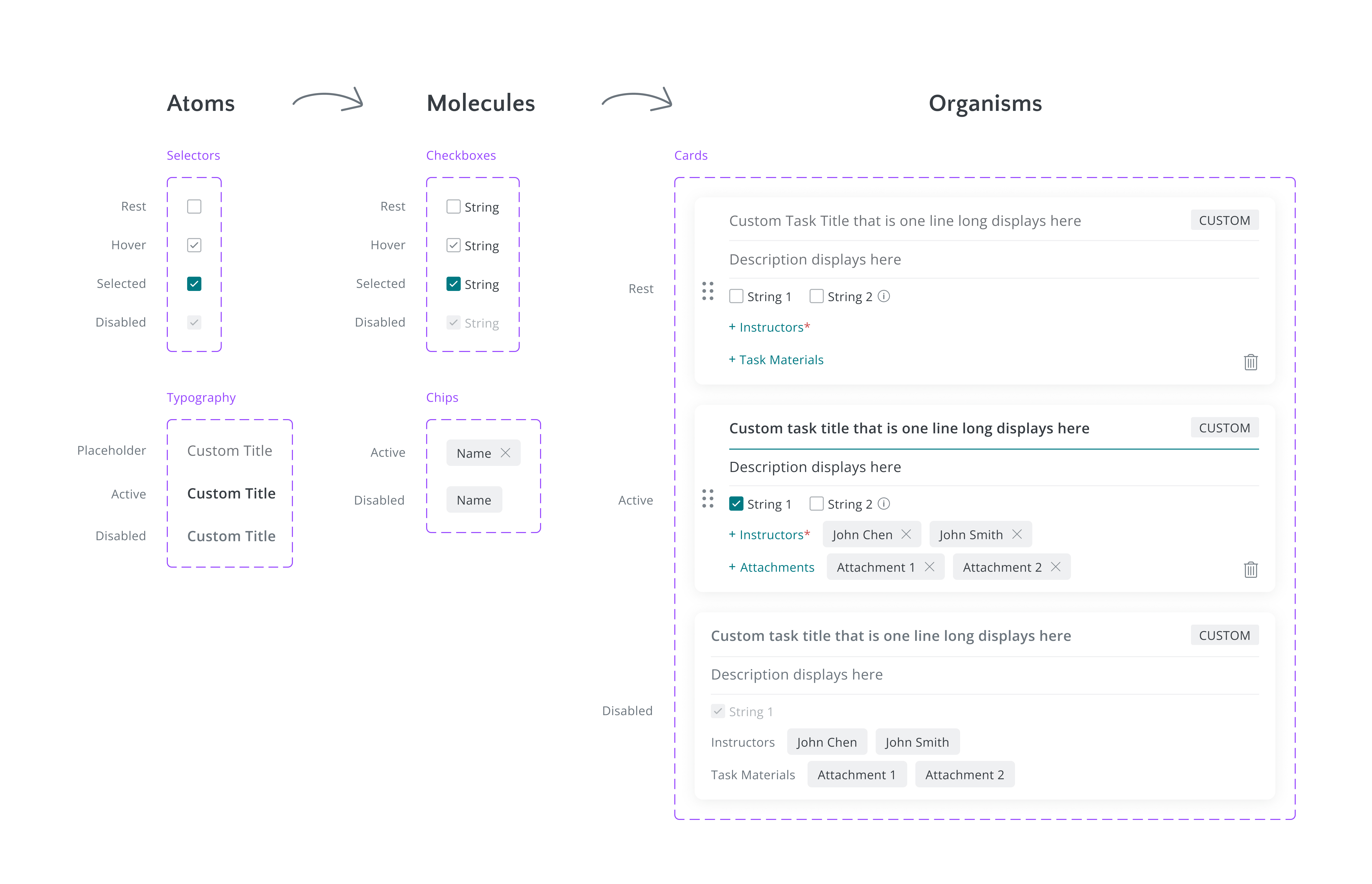
To create these components, I utilized Brad Frost's Atomic Design methodology, specifically the transition from atoms to organisms. This approach allowed me to rapidly create more complex components from smaller, reusable parts.
Accessibility is a crucial aspect of the components I built. I utilized contrast plugins in Figma to evaluate colors to ensure they meet accessibility standards for contrast ratios. This helps make components such as buttons easily distinguishable for users with visual impairments. I also focused on designing read-only states for forms, providing clear feedback to users while maintaining a visually accessible experience.
For component naming, I employed a slash/naming convention to effectively organize styles into logical groups. This structure makes it easy to identify related components at a glance. Additionally, I used PascalCase (e.g. “Icon/Outline/AssignCourses”) for naming components to align with React best practices. This convention not only enhances code readability but also ensures seamless integration within the React ecosystem, allowing for clear differentiation between components and promoting a standardized approach across the design system.
To ensure a collaborative approach between the Design and Engineering teams, I conducted research on Tailwind CSS and focused on adopting designs for datasets and tables. By leveraging Tailwind's framework, I established a solid foundation that allows developers to pull code directly from Tailwind as a base before applying further styling. This strategy supports Engineering’s needs to transition to Tailwind by enabling them to easily customize components according to specific project needs.

For the stepper component, I designed a tree view that features expandable and collapsible elements. The developers initially expressed concerns about its complexity when I presented it to the team. However, to address this, I researched and found a customizable React component from Material UI that provided our engineering team with a practical starting point.
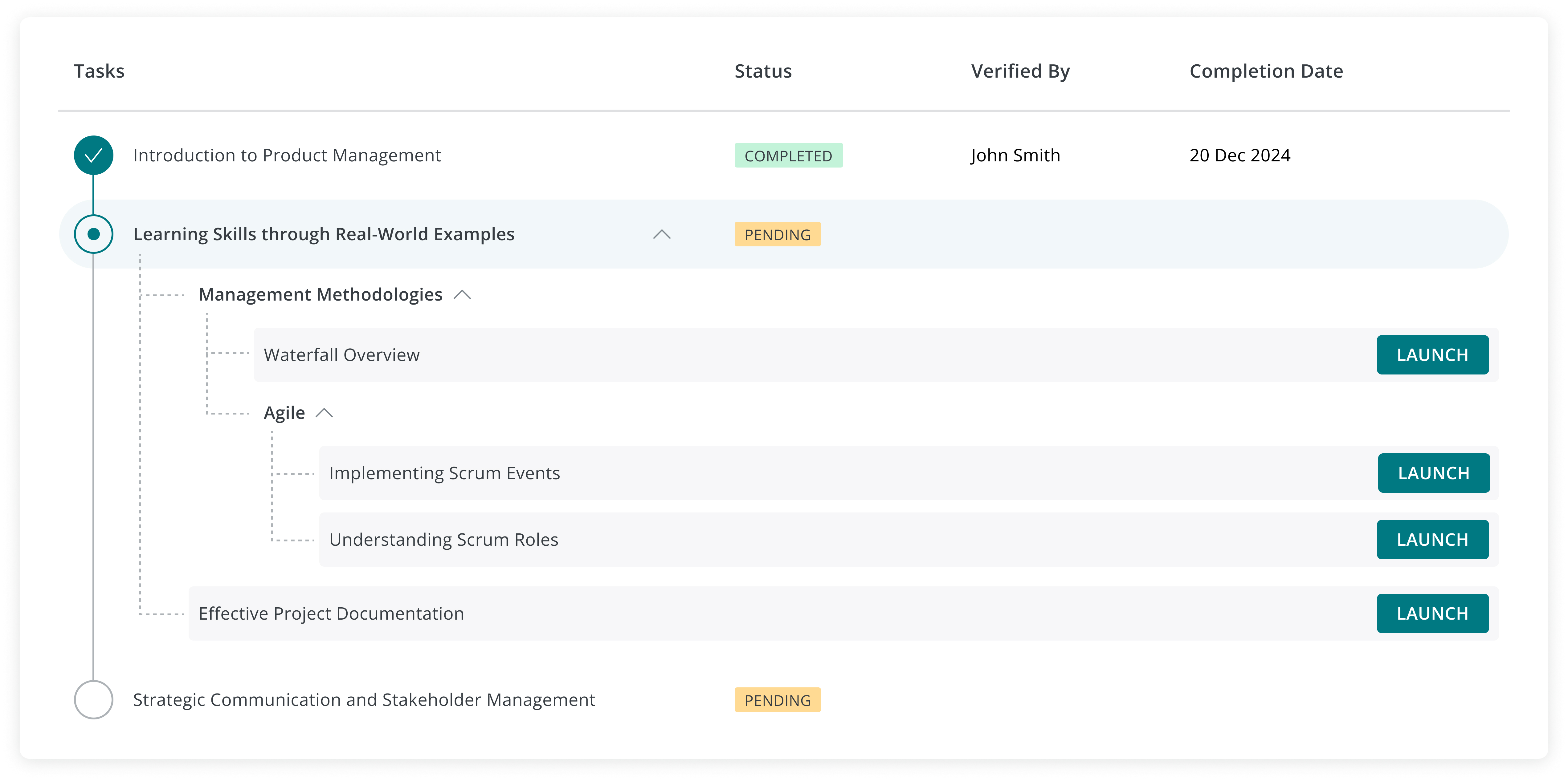
After reviewing the Material UI component, the developers confirmed that it was feasible to apply further styling to the component to align it with my original design. This collaborative effort between engineering and design not only resulted in a more workable solution but also strengthened our teamwork in refining components for the design system.
To ensure that our design system meets the needs of all users, I conducted discovery and usability testing surveys to gather feedback on the Cards and Labels components. These surveys aimed to assess whether the components were intuitive and user-friendly. By actively involving stakeholders in this feedback process, I was able to gain valuable insights that informed refinements and enhancements to the design system.
While having an organized Figma file is essential, the true success of a design system lies in how effectively designers and engineers apply it. It's vital for the entire team to understand the value the design system brings. It is not just a set of assets; it is a powerful tool that enhances efficiency, consistency, and creativity in our design process.