Ed-Tech @ Applied Medical
Learning Management System
Enhancing Mobile Usability for
IMPACT
Industry-standard mobile design is introduced to the in-house Learning Management System (LMS) to allow field staff to complete courses efficiently using their mobile devices on-the-go. This LMS is crucial for managing, tracking, and delivering educational courses and training materials. It serves both internal staff and external users, such as distributors and surgeons. This in-house LMS reduces costs by $1.2 million annually by eliminating the need for a paid Cornerstone subscription.
View PrototypeContents
Approach
Agile, Mobile Interface Design
Team
Product Manager, Full Stack Engineers, Business and Quality Analysts, Application Architect
PROBLEM
Users are struggling to take courses, complete tests, and sign training materials.
Given that many users access the LMS application while on the go, optimizing the mobile view is crucial for ensuring a seamless user experience. Currently, key functionalities are difficult to access on the mobile version. How can we adapt the desktop design for mobile while maintaining all functionalities and improving the overall user experience?
SOLUTION
Redesigning the Mobile Experience
Design guided by industry standards and best practices
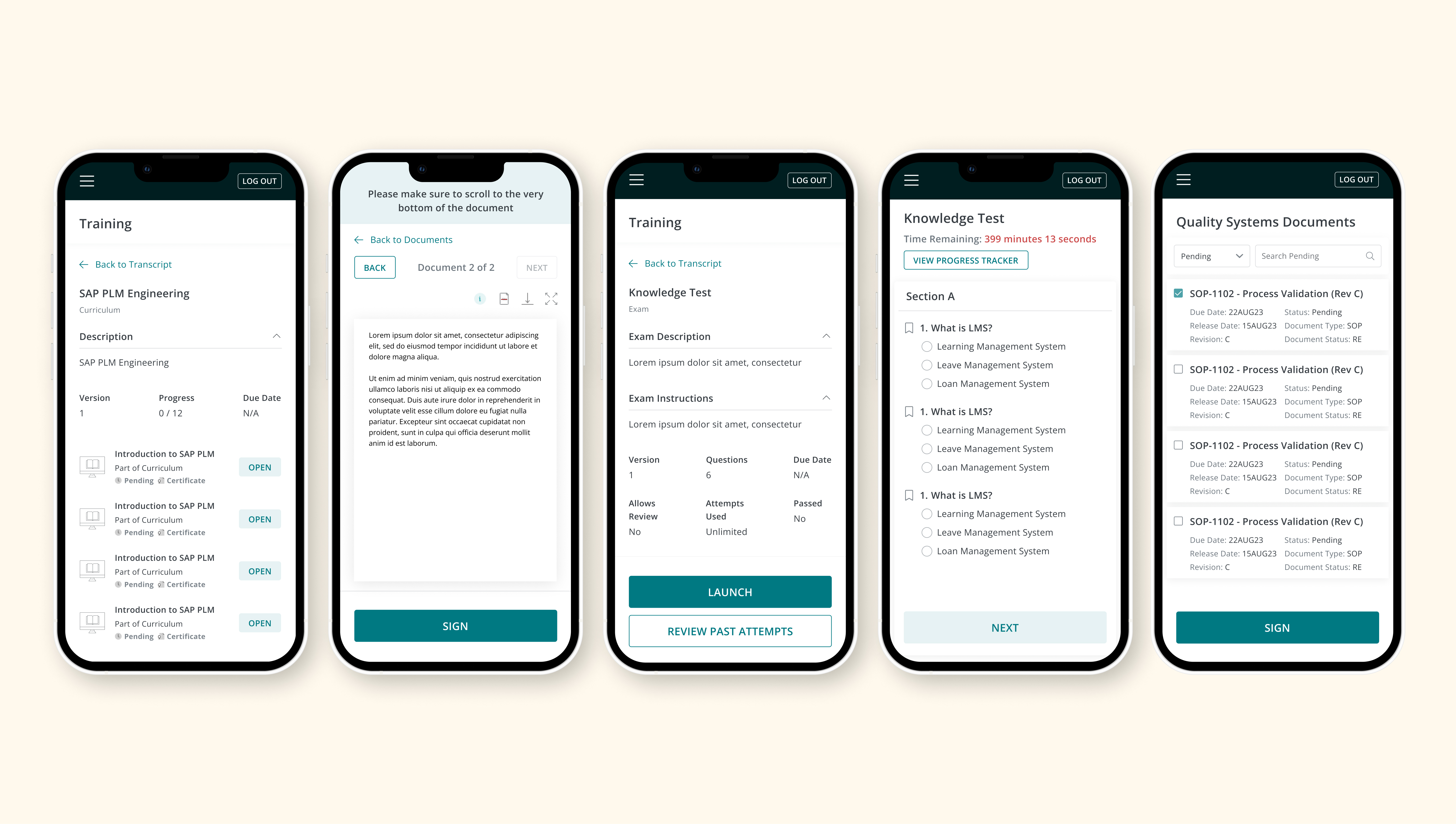
PRODUCT
Productive Learning at your Convenience

Sign Controlled Documents
Read and acknowledge assigned controlled documents

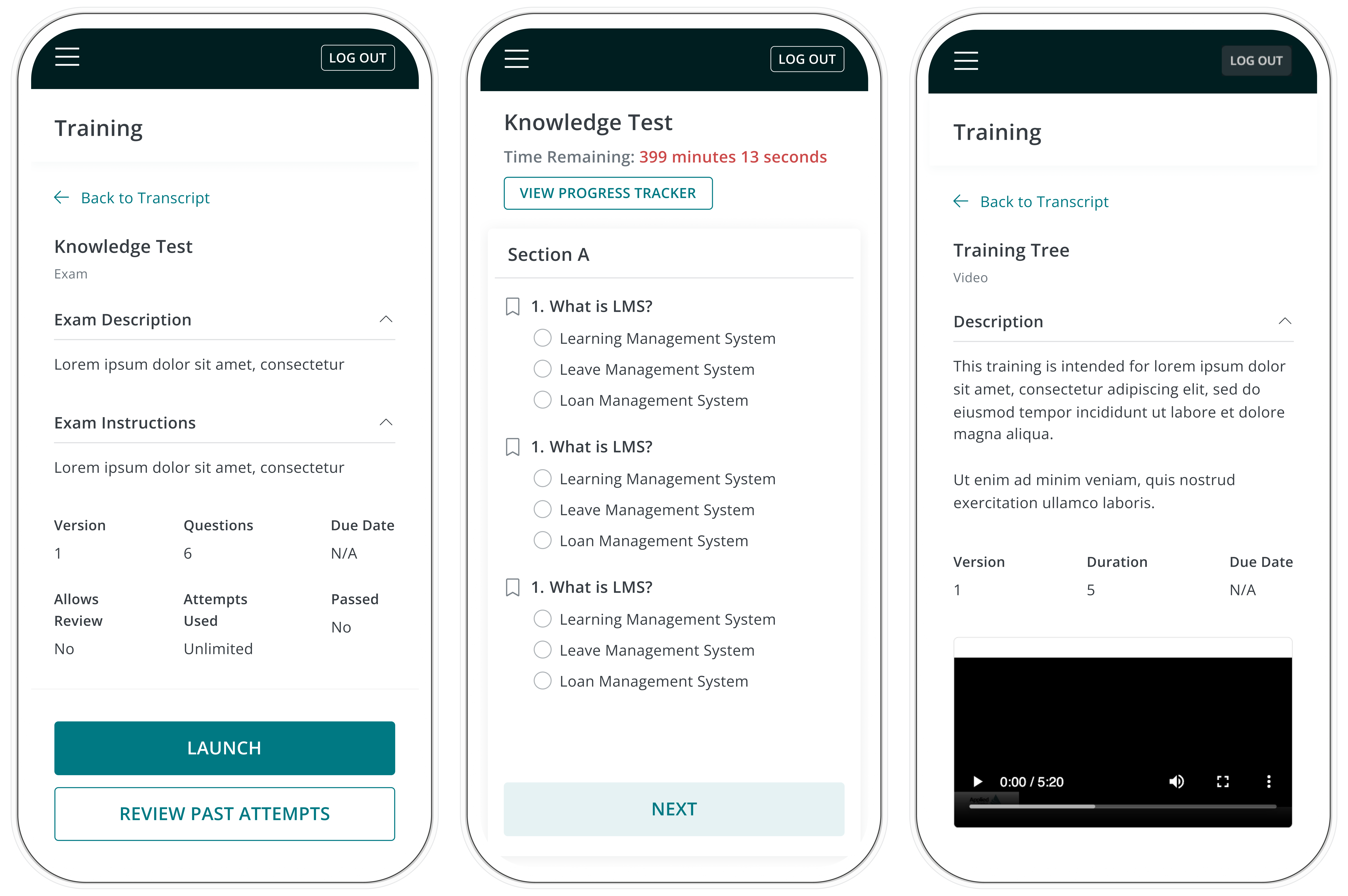
Launch courses and take tests
Complete assigned courses and put your knowledge to the test
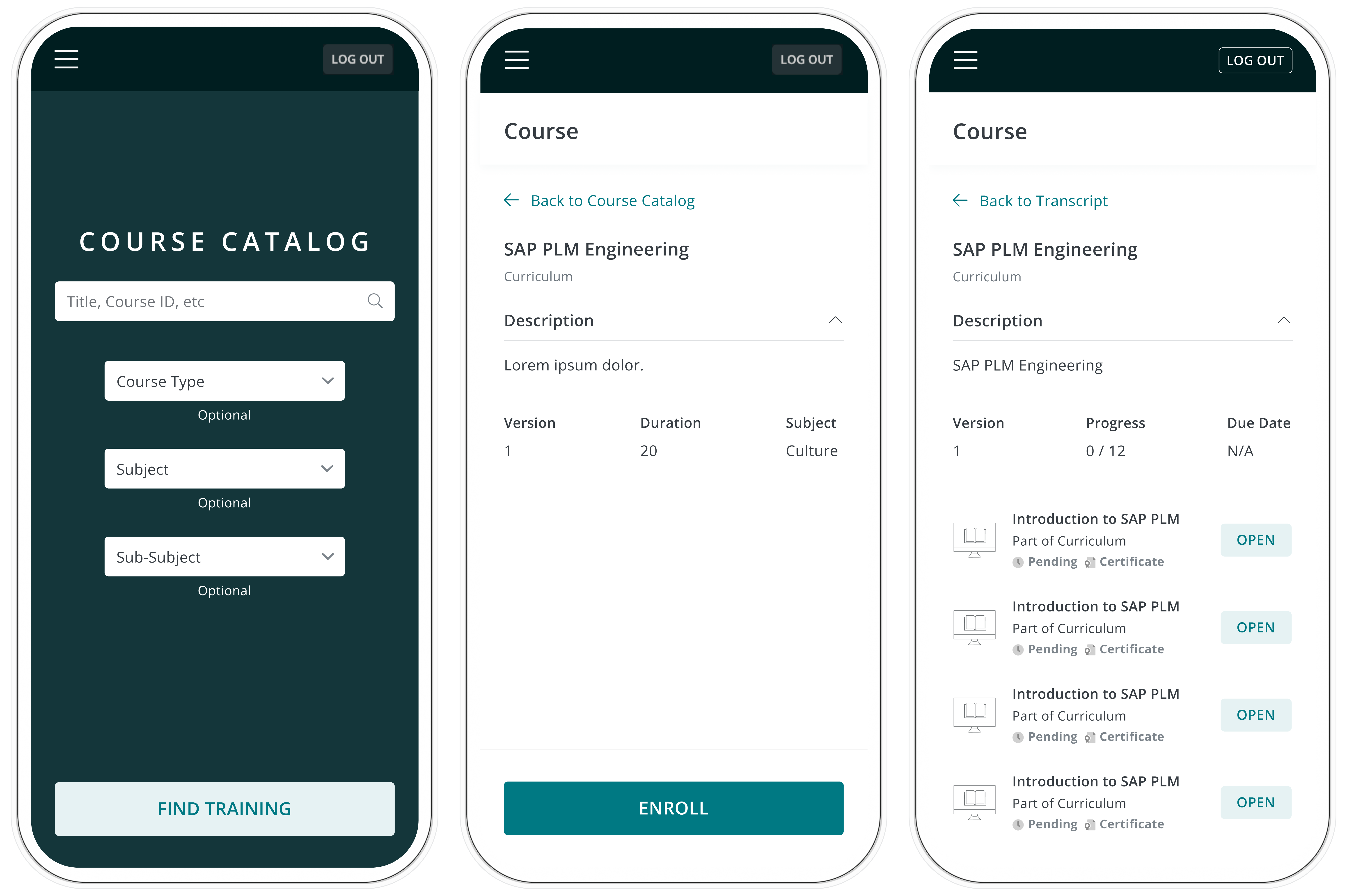
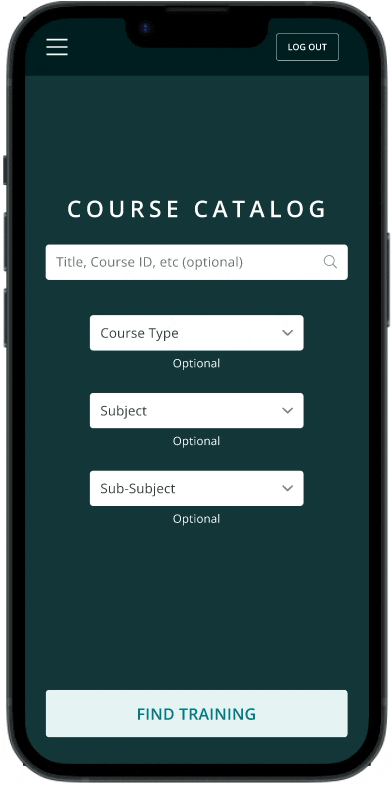
Search and enroll in courses
Browse the course catalog and enroll in classes, curriculums or events
HYPOTHESIS
LMS needs to be optimized for mobile responsiveness
Due to LMS pages not displaying correctly on mobile devices, users must complete their training tasks on a desktop computer which restricts their ability to finish tasks at their convenience. Additionally, on the administrative end, team leaders face challenges in assigning courses to their team due to limitations in the user interface.
EMPATHIZE & DISCOVER
The mobile version of LMS would be more usable if:
- Elements on a page were reorganized to eliminate horizontal scrolling
- All elements on the desktop version are also shown on mobile
During the requirements gathering sessions with the stakeholders and business analysts, I was able to find that the most common mobile devices used in the field were recently released iPhone and Android models, with iPhones being used primarily in the United States and Android reigning majority usage overseas. Tablets were used much less. Previously not knowing the range of screen sizes to design for, this knowledge from user analysis helped me narrow down my scope.
I was also able to identify which modules in the LMS would take design priority based on stakeholder needs. Main end user facing pages such as signing up for a course or curriculum, test taking, and course catalog pages would take precedence over administrative pages.
Interview Questions
- What are some of common phone models used?
- Which modules of the LMS are users struggling with?
- Which parts of the process need visual improvement?
- Which modules would you like to prioritize?
- Is the process of viewing and signing documents intuitive?
DEFINE
Defining the scope and design timeline
From the discovery phase, I was able to specifically pinpoint what the stakeholders are struggling with on LMS in terms of UI:
Main Challenges
Horizontal scrolling is not intuitive
Buttons are cut off and are too small
Inconsistent margins throughout the page
Documents do not launch correctly
Important information aren't displaying
Based on these insights, I evaluated the business requirements and the current state of mobile pages for both the end user and administrator personas. Using the agile methodology, I decided on the timeframe needed to complete the redesign and gave my team the time estimates for redesigning each module. With this in mind, I started creating mockups in Figma in preparation for handoff to the developers.
IDEATE & DESIGN
Delivering value on top of business requirements
While I was doing a deep dive into the current mobile views, I noticed that components such as font sizes, styling, colors, and button sizes were not built according to mobile design guidelines. Since users will be using LMS on their phones on-the-go, accessibility would play a big factor in making this mobile launch successful, especially because many LMS users are generally older and would greatly benefit from accessibility enhancements.
Though the only ask was to organize the screen and fix alignment issues to eliminate horizontal scrolling, I wanted to advocate for users while providing stakeholders with additional value. I created two versions of my mockups - the first containing customer requirements and the second containing both requirements and accessibility enhancements.
I presented both versions to the team and sought feedback from the engineers and project manager on how the overall sprint timeline would be impacted should these nice-to-haves be included. Fortunately, the engineers are able to fit building these enhancements into the current timeline without pushing back the estimated deployment date, leading to a win-win situation.
.svg)
High-Fidelity Screens
Keeping the style guide in mind, I created a high-fidelity prototype on Figma for user testing and feedback.
The Prototype

Link to interactive prototype
IMPROVEMENTS
Significant Design Improvements
With the defined requirements, mobile design guidelines, and feedback in mind, I made some major design improvements to the LMS modules:
Main Feedback:
Major Improvements
First.
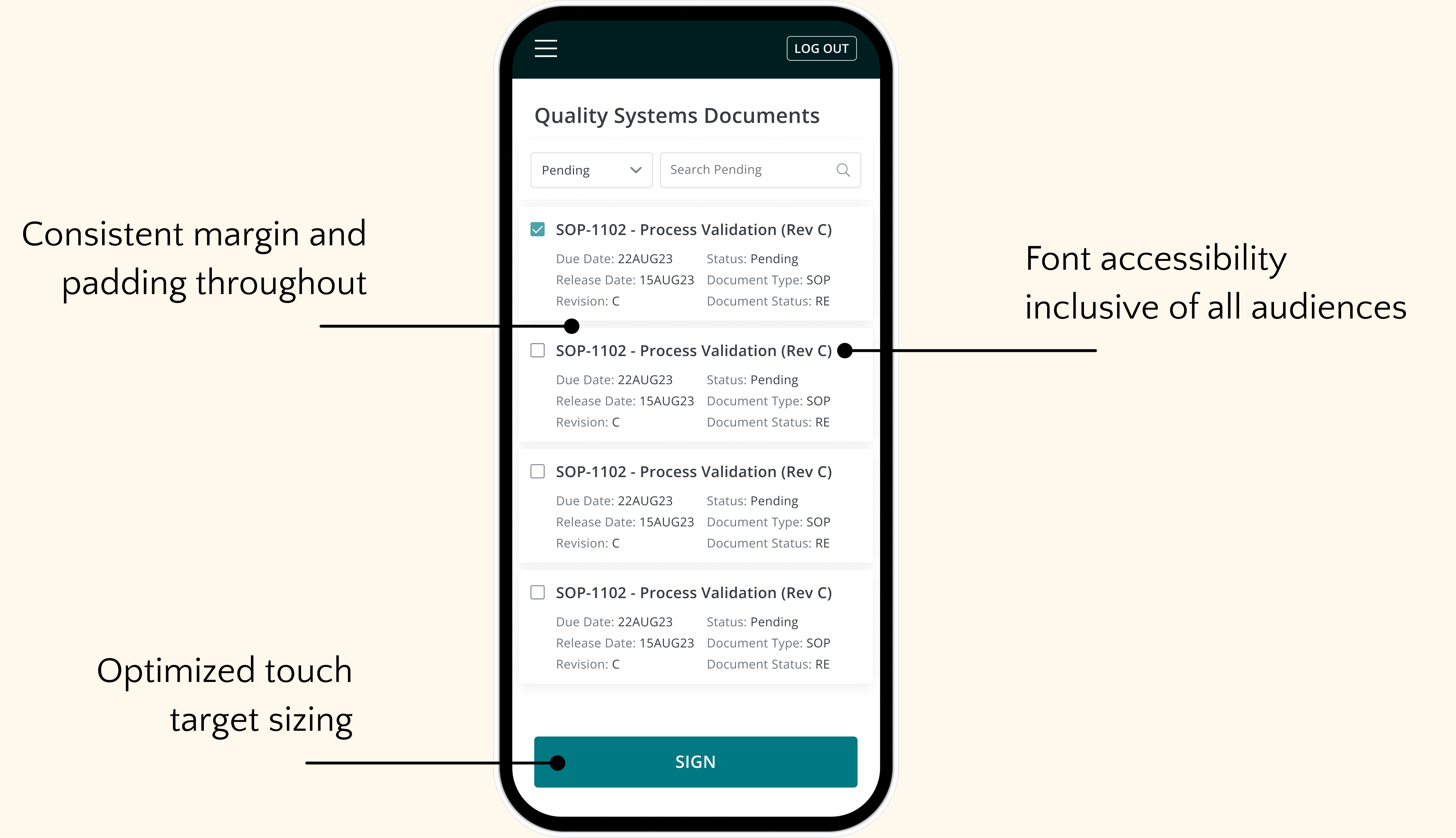
Touch targets: Account for the physical dimensions of users
Why?
The current size of the “Enroll” buttons are too small, making it difficult for users to tap them quickly when enrolling in a course. Increasing the button size to better accommodate the average adult finger pad will allow quicker access to the next step of the enrollment process.

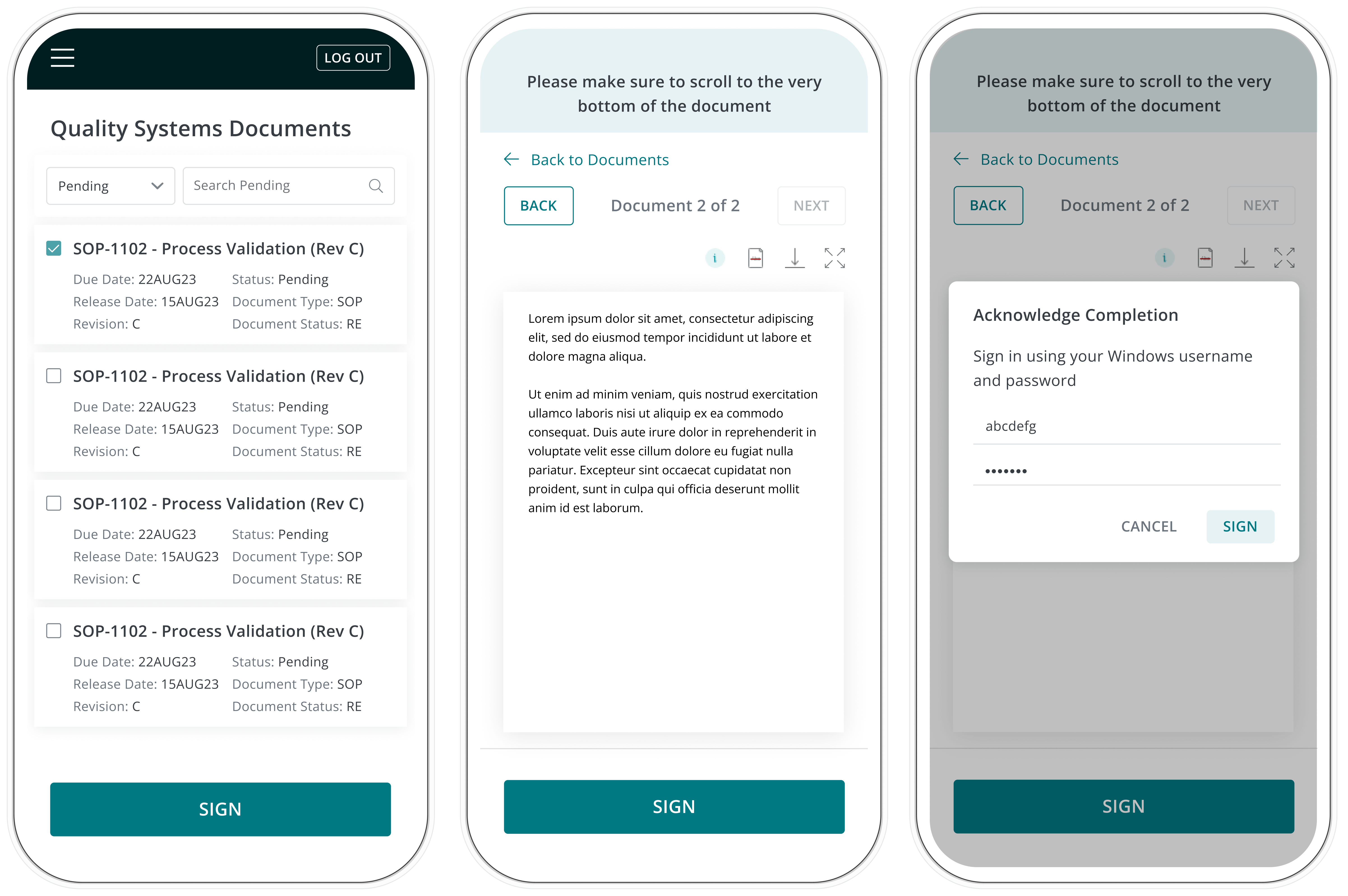
Second.
Reorganizing information: Ease of use
Why?
Users currently have to scroll horizontally while reading assigned documents. I redesigned these pages to fit both the document and its action buttons within the viewport, and added a reminder to scroll to the bottom of the document to enable the “Sign” button.
.svg)
Third.
Accessible designs: Accommodate wider range of users
Why?
Font sizes, colors, and icons were updated, and modals were made more intuitive across all modules. By enhancing these elements, I effectively balanced user advocacy with business needs.

REFLECTIONS ON THE PROCESS
Learnings & what I’d do differently next time
1. Importance of communication
I found it incredibly helpful to break down goals into smaller tasks and collaborate with the developers at each stage. By assigning roles on the Kanban board and managing tasks through the stages of design, development, and redlining, we maintained a smooth and efficient cadence towards project completion.
2. Balancing both business and user needs
Although it was important to account for general design updates needed by the business, I found it crucial to also think about users’ pain points in order to solve for the root of the problem – accessibility. This approach likely helped avoid potential rework by addressing the root cause before it could become an issue in the future.
3. Value of a design system
Utilizing a design system with standardized font sizes, weights, and colors that adhere to mobile design guidelines allowed for the swift and efficient creation of Figma mockups. The design system also helped in ensuring consistency of the overall look and feel of the product.
Thank you for reading!


