Sales Application @ Applied Medical
Customer Relationship Management
Data Visualization and Analytics to Drive Strategic Growth
IMPACT
The CRM streamlines the Sales team’s workflow by managing customer relationships, tracking leads, and converting opportunities into sales. By centralizing customer data and presenting it through clear and intuitive visualizations, the CRM enhances the team’s ability to make data-driven decisions. Additionally, potentially building the application in-house offers a cost-effective solution, eliminating the need for third-party subscriptions and providing long-term financial savings amounting to $1.8 million annually.
Contents
Approach
Waterfall, Desktop and Mobile Interface Design
Team
Full Stack Engineers, Application Architect, Business Analysts, Project Manager, Sales Team
PROBLEM
Evaluating the most cost-effective CRM solution
To make an informed decision from a business point of view, we need to compare the cost of in-house development with third-party CRM subscriptions (e.g. SAP Sales Cloud, Salesforce, or HubSpot). The challenge lies in providing cost and timeline estimates for the in-house solution to enable a clear comparison between the build-versus-subscription options.
SOLUTION
Designing the core CRM experience
The goal of the CRM is to optimize sales strategy and stakeholder engagement through data-driven decision-making. From a technical perspective, the solution also needed to integrate with existing enterprise tools—specifically SAP S/4HANA and Power BI — to centralize data and reduce system fragmentation.
To accurately scope time and development costs, I designed a comprehensive CRM ecosystem with the following key components: Home, Opportunities, Accounts, Contacts, Activities, Leads, Territory Management, and Analytics. For the purpose of this case study, I’ll focus on the three main dashboards that best illustrate the user experience and strategic impact:
1. Home Dashboard - A central hub for high-level KPIs and daily priorities

2. Opportunities Dashboard - Track pipeline progress, prioritize efforts, and identify potential roadblocks
.svg)
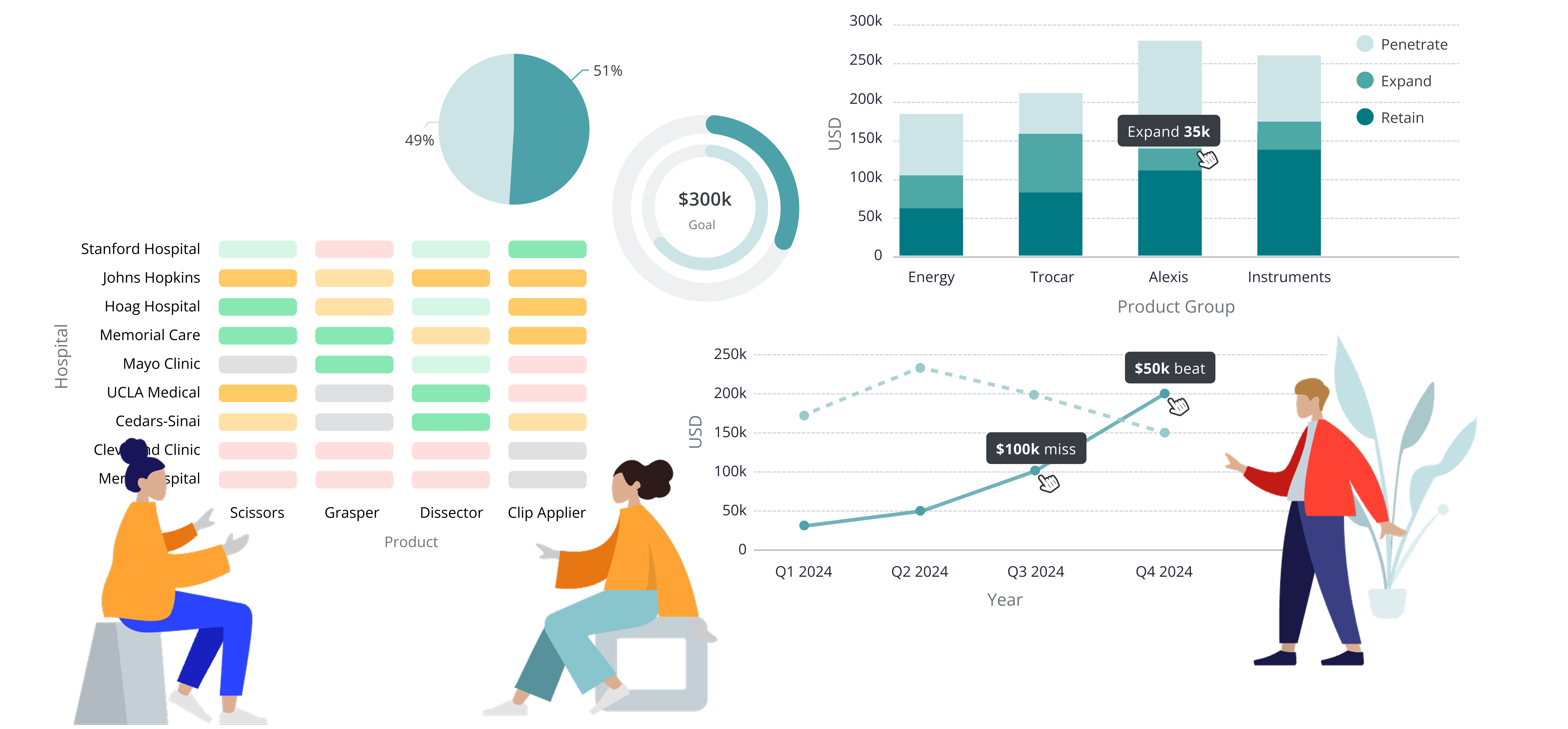
3. Analytics Dashboard - Deep insights into sales performance, market trends, and engagement patterns
Monitor sales progress anytime, anywhere on mobile
Home Dashboard
KPIs and pending tasks accessible at your fingertips, giving you instant visibility into your team's performance and priorities
Opportunities Dashboard
Access to your opportunity pipeline, including in-depth views of each opportunity
EMPATHIZE & DISCOVER
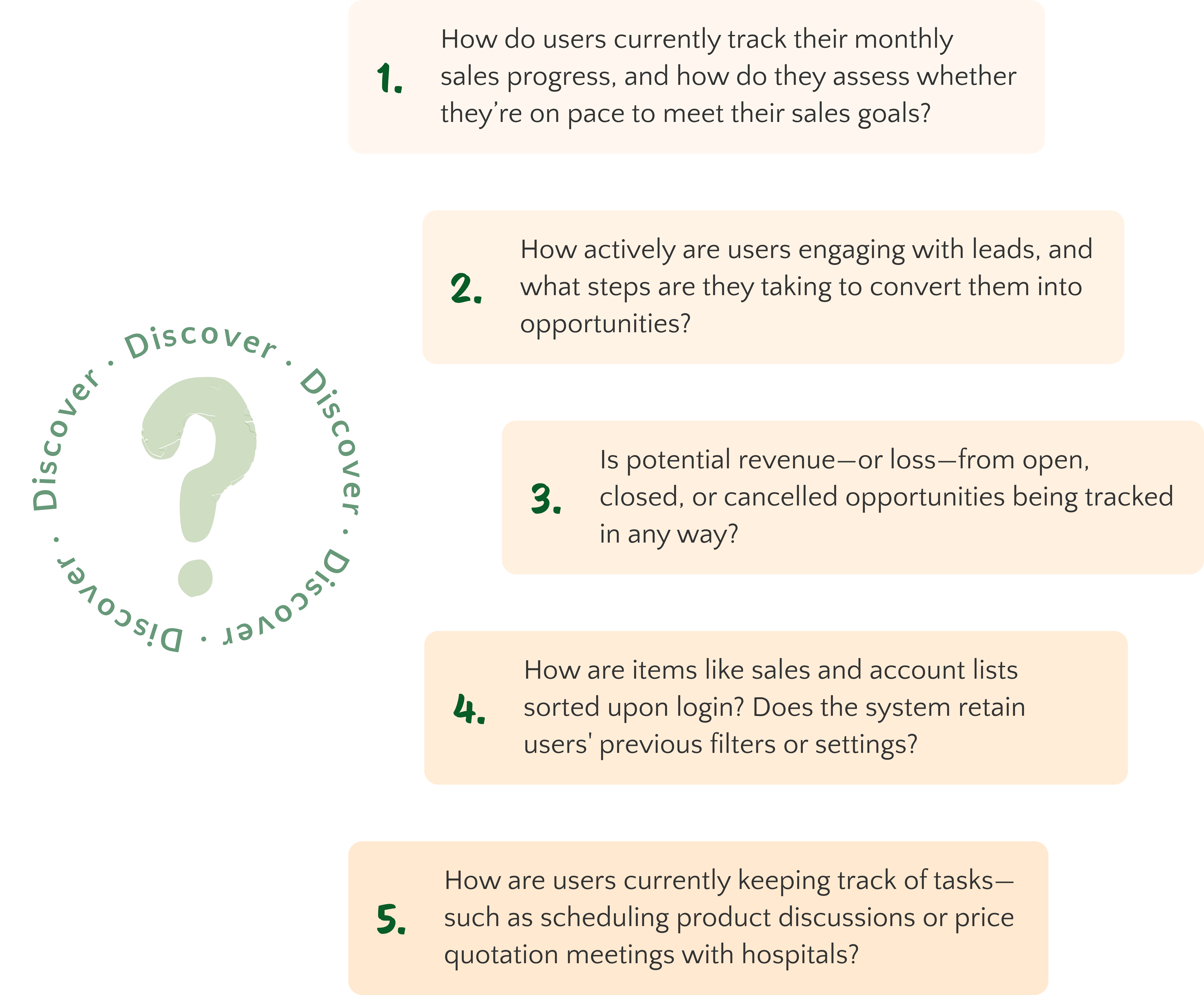
Sales team discovery sessions to understand the current sales process
Before defining the key features of the CRM dashboards, I needed to immerse myself in the Sales team’s world. What exactly is an “opportunity”? How do leads, accounts, and contacts interconnect within the sales process? What data do they rely on to make decisions—and who gets to see what?
To answer these questions, I kicked off a series of discovery sessions with the Sales team. My goal was to understand not just the terminology, but the bigger picture: how their processes work, how territories are structured, and how roles like individual contributors, managers, and admins differ in terms of access and responsibility.
Below is a non-exhaustive list of questions that guided these conversations:
DEFINE
Defining the pain points & project scope
The collaborative discovery sessions allowed me to ask targeted, open-ended questions that revealed the team’s real challenges with their current tools. What emerged was a clearer understanding of what they needed in a CRM—not only in terms of features but also how it fits their overall goals.
The challenges identified here defined the problems I needed to solve for and formed the foundation of my design work.
IDEATE
User flows
With the freedom to design the CRM from the ground up, we were able to fully customize it to highlight the most relevant information and create a user flow that best fits the users’ needs.
Exploring initial concepts with the Sales team
With a deeper understanding of the Sales team's motivations and objectives, I began ideating potential features and layouts for the dashboards. My goal was to create an interface that prioritized clarity, speed, and insight—aligning directly with the pain points uncovered during user interviews.
I sketched out early concepts and wireframes, continuously seeking feedback through whiteboarding sessions with the sales team. Their input directly influenced layout decisions, visual hierarchy, and feature prioritization. Some of these collaborative ideation sessions are shown below:
DESIGN
Where ideas take shape
To ensure the final designs directly addressed the Sales team's pain points, I mapped key user challenges to specific features in the high-fidelity dashboards. Each solution was thoughtfully integrated into the interface to improve efficiency, clarity, or ease of use. Below, you’ll find a series of features and corresponding designs that respond to real user needs—bridging insights from research to tangible outcomes.
Designing for clarity in complex data analytics
The analytics dashboard required careful consideration of how to effectively present complex, multi-dimensional data in a way that supports the Sales team's decision-making without causing cognitive overload. The challenge here lies in balancing depth with clarity—ensuring users can scan for key insights quickly, while also allowing deeper exploration when needed.
The table below outlines the core features included in the analytics dashboard, their intended purpose, and the rationale behind each design decision to deliver a user-friendly, data-rich experience.
With a focus on visual clarity, interactivity, and intuitive structure, the analytics dashboard helps the Sales team surface key insights without the noise. User feedback highlighted how features like KPI tiles and the dual-axis chart simplified performance tracking, while the heat map and interactive map offered meaningful spatial and temporal context. These feedback validated the design approach and emphasized the importance of matching visualization techniques to the Sales team’s goals, workflows, and mental models.

Designing the CRM mobile experience
The goal of the mobile design was to translate a dense desktop interface into a streamlined, user-friendly experience without sacrificing functionality or clarity.
I focused on optimizing the interface for quick comprehension and thumb-friendly interaction, while also ensuring accessibility. To achieve this, I used vertical stacking for easier scrollability, and implemented larger tap targets along with optimized text sizes for better readability.
To see how these design decisions come together in the final product, explore the full high-fidelity mockups in the Solution section.
OUTCOME & NEXT STEPS
Timeline Estimation for Full CRM Development
1. Design Reflection
Throughout this project, I collaborated with the sales team to understand real-world CRM workflows and pain points. This insight guided me in designing a user-centered interface that balances complex data with clarity, works seamlessly across devices, and prioritizes accessibility. Iterating through feedback and constraints helped shape a scalable solution that truly supports how sales teams work.
2. Development & Architecture
The development and architecture teams will provide their time estimates based on the designs created, taking into account real-time data processing, API integrations, database design and management, as well as scalability.
3. Cost Comparison
Once we have these estimates, we will compare the in-house CRM solution's projected costs with third-party subscription options. This comparison will help us determine the most cost-effective solution for long-term savings. Stay tuned to see if we decide to go with the in-house solution!
This is a live project — check back for updates!


.png)