SAP PLM & Fiori @ Applied Medical
Equipment Management
Optimizing Engineering Teams with
At Applied Medical, I led the design of a new equipment management system in SAP Fiori. As a medical device manufacturing company, this system is heavily used by the maintenance and engineering teams to request, schedule, and track the completion of preventative maintenance (PM) tasks to sustain manufacturing equipment.
View PrototypeContents
Approach
Waterfall, Desktop Interface Design
Team
Product Manager, Full Stack Engineers, Business and Quality Analysts, Application Architect
PROBLEM
A manual submission, approval, and data input process
Maintenance and engineering teams are struggling with the existing equipment management system, finding it both time-consuming and inefficient. The current process requires users to manually complete a form and list approvers, after which the data is entered into SAP manually. This laborious process not only hinders efficiency but also complicates data analysis and audits, as it relies on retrieving paper records. How can we streamline and enhance the submission request workflow to address these issues?
SOLUTION
An automated and centralized management system
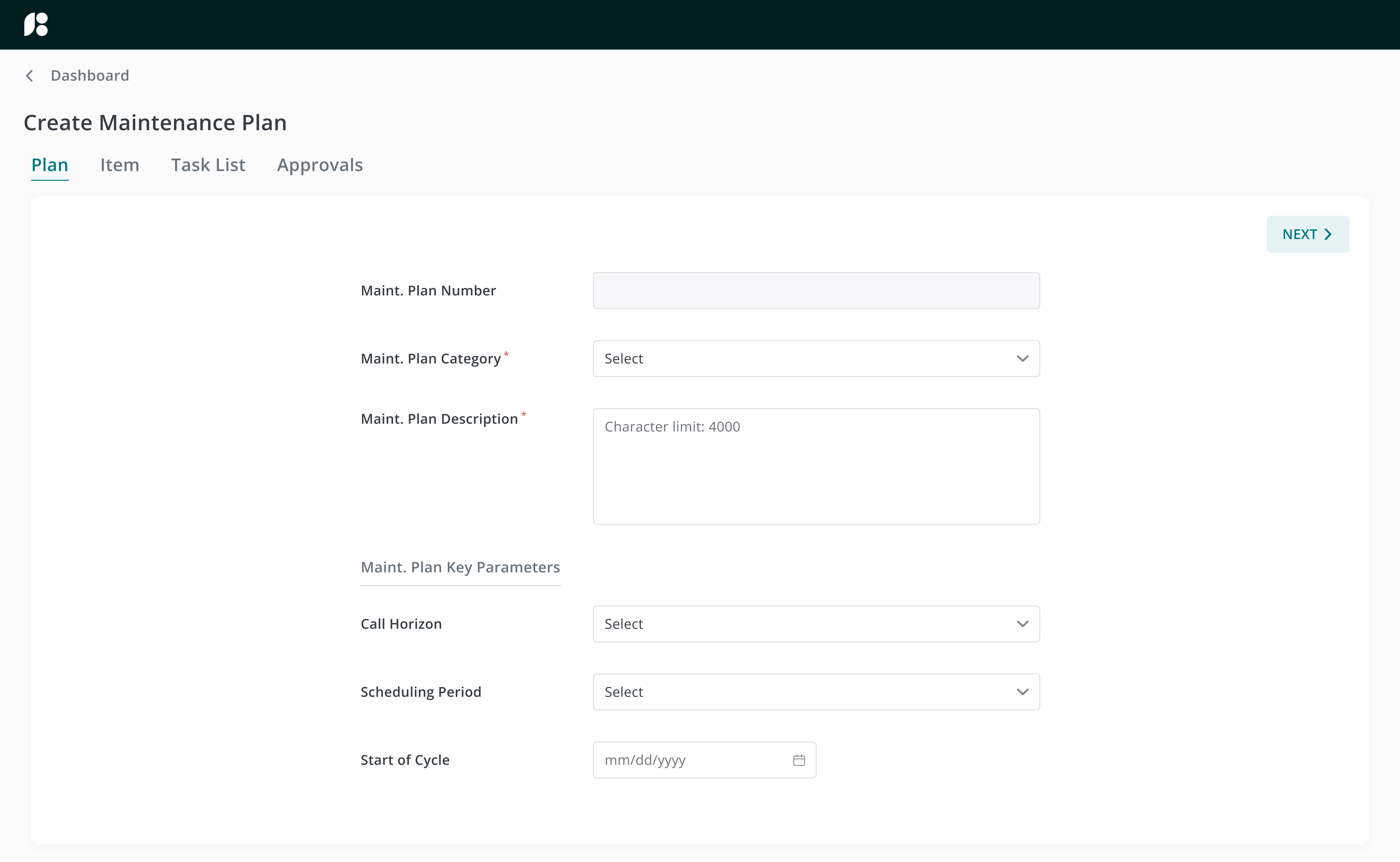
Create/edit maintenance plans and equipment information
- Save resources: Eliminate the need for paper forms during submission
- Reduce costs: Eliminate intermediary to manually input data
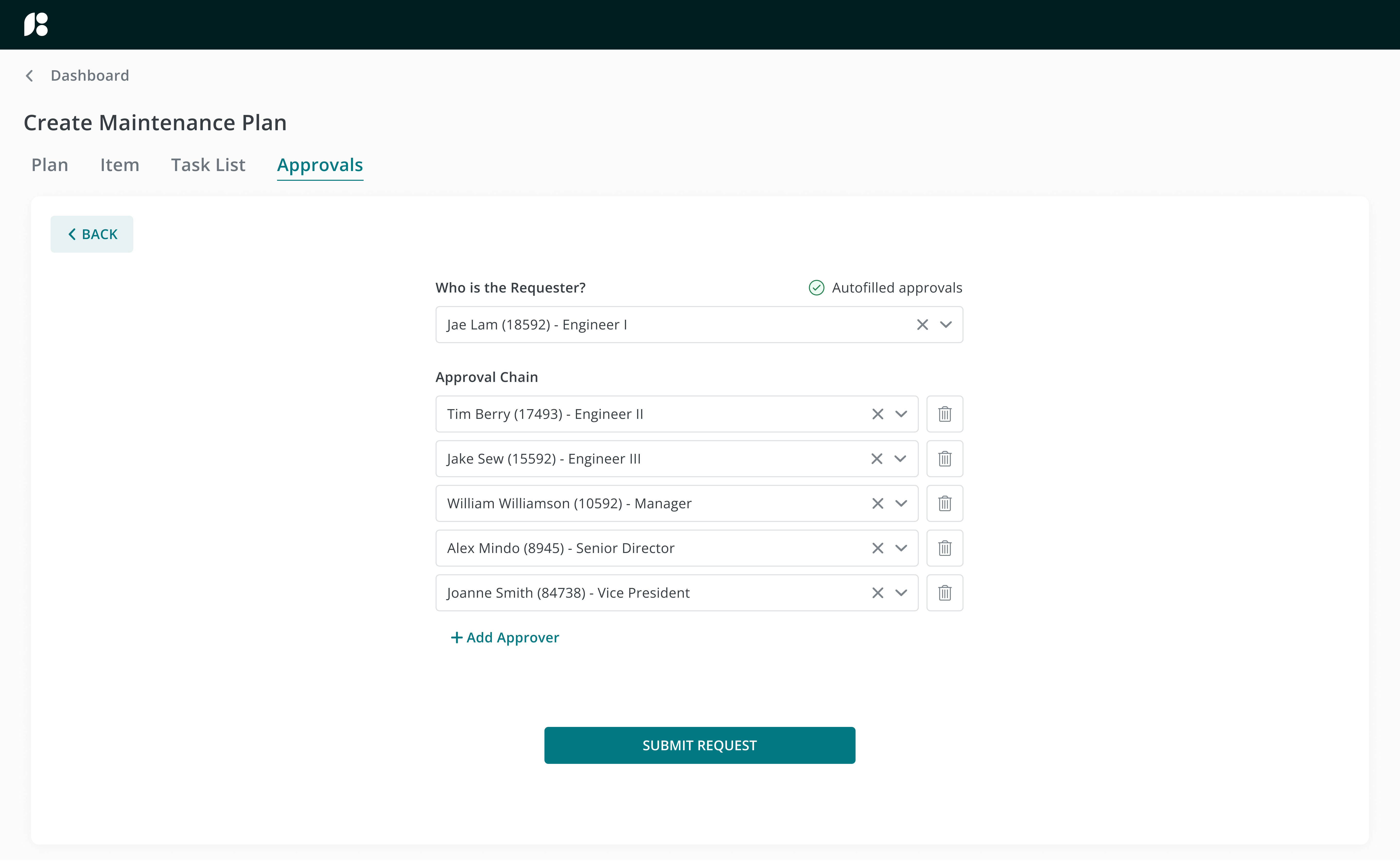
- Automate processes: Autofill individuals in the approval chain
PRODUCT
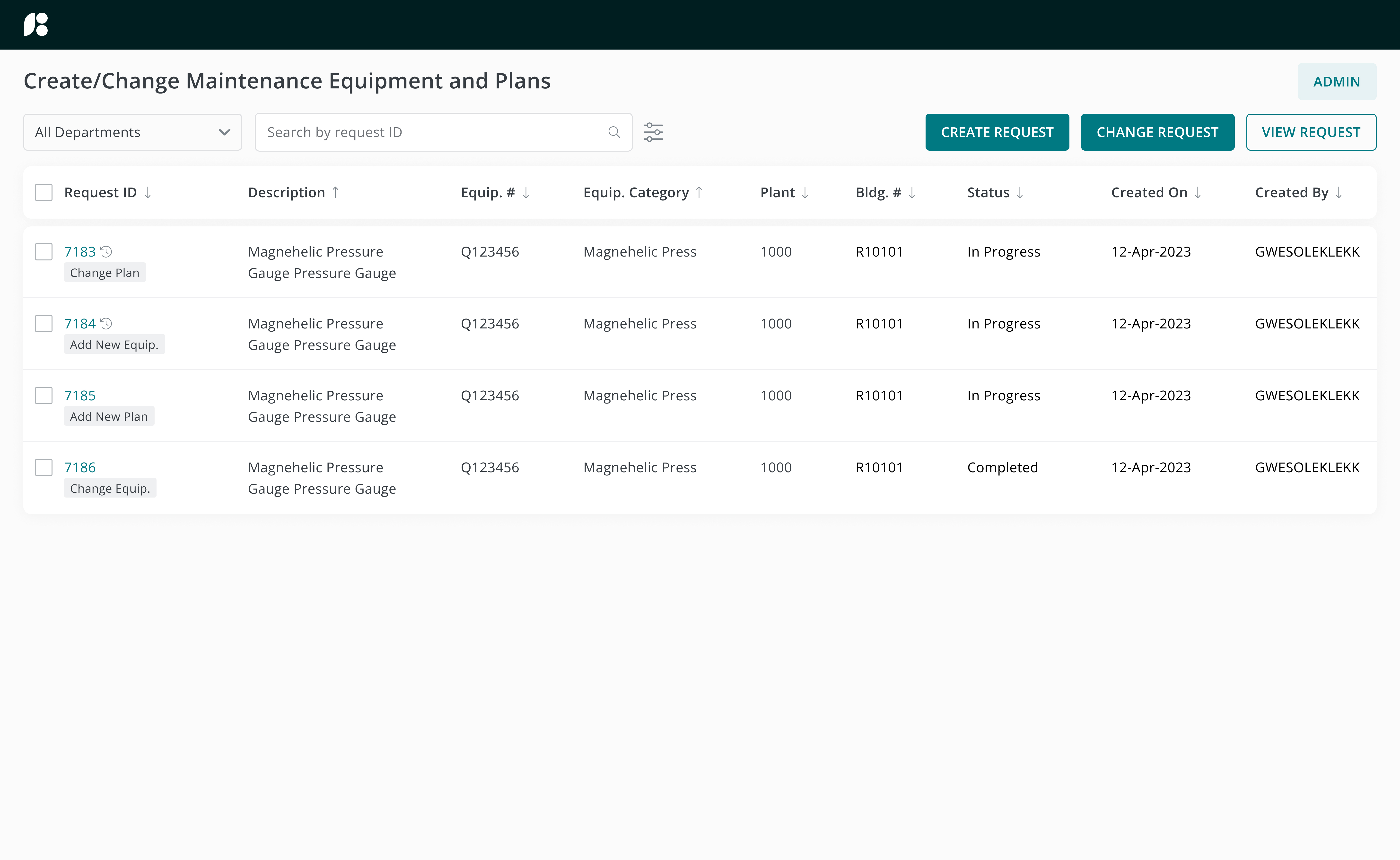
Maintenance activities and equipment information in one place

Request, schedule, and track
View existing maintenance plan requests and create new plans via an approval chain
HYPOTHESIS
The manual PM request submission and data input process needs to be automated
Due to PM information being recorded using physical forms, one would have to hunt down these copies should they need access to information. Having a centralized PM database where users can access at anytime will increase visibility of PM requests and their statuses throughout the company.
EMPATHIZE & DISCOVER
Engineers would find the equipment management system more convenient if:
- The statuses of all PM requests can be easily accessed
- The form submission process can be made digital and approvals automated
Before diving into design, I came up with some questions for the stakeholders and business analysts in order to fully understand their pain points and the problem I was solving for:
Interview Questions
- What are some useful information you would like to see on a dashboard?
- What is the current workflow for editing maintenance plans?
- How are forms filled out and uploaded?
- What information should be auto-populated based on user response?
- Do approvers vary based on request type?
DEFINE
Defining the scope and design timeline
From the discovery phase, I was able to understand the current request submission workflow and its associated challenges:
Main Challenges
Sections on the form are not clearly marked
Unsure what to enter - no suggested responses for each field
Unsure which fields are required or optional
Unsure if a request has already been submitted for the same equipment
Entering in each approver is time consuming
Looking at the current workflow as a whole, I broke down the product into smaller deliverables. I decided on the estimated timeframe needed to complete designing for each milestone and proposed frequent working sessions with the business analysts to ensure that my designs align with the intended functionality of the product and that I’m on the right track.
IDEATE & DESIGN
Designing new features
From the information gathered during the discovery phase and keeping the estimated timeframe in mind, I brainstormed a few ideas on how the potential new product will look like. I thought about what main features to build and sketched out ways on how sections on forms can be segregated for them to be intuitive to the user.
The MVP will include:
A Dashboard
- View all active and closed requests
- Create or edit PM requests
- Access to admin portal
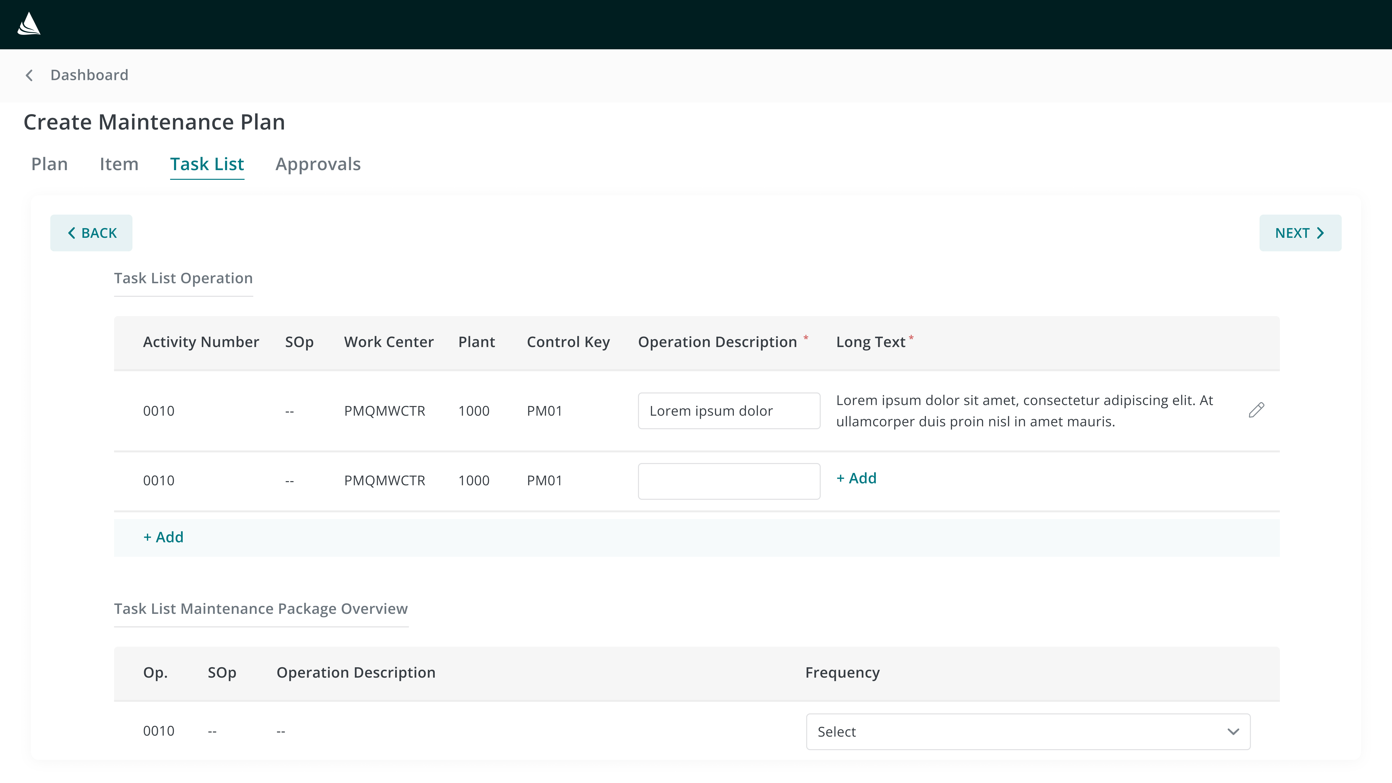
Create and Change Forms
- Required/optional fields
- Upload attachments
- Approval chain
Throughout designing, I utilized the design system to ensure that I am not building components from scratch where unnecessary. Other enterprise apps within the company were also referenced for styling suggestions to make sure that all apps stay consistent within branding guidelines.
High-Fidelity Screens
Keeping the style guide in mind, I created a high-fidelity prototype on Figma for user testing and feedback.

The Prototype
Link to interactive prototype
IMPROVEMENTS
Significant Design Improvements
From my initial drafts, some improvements were made to each iteration of mockups. Here’s how my designs evolved based on research and feedback:
Main Feedback:
Major Improvements
First.
Help users recognize rather than recall information
Why?
Rather than having the requester remember their approvers’ unique ID numbers, the approvers are autofilled based on the organization chart. Users have the freedom to remove or edit these individuals based on their needs.

Second.
Displaying user input at a glance
Why?
As users typed within the text field, sentences would get cut off from view as the text field can only display a limited amount of characters at once. By using a modal, users can view their entire input both while typing and after submitting, ensuring that no text is hidden from view.

Third.
Breaking down components so that they’re easily digestible
Why?
The form was initially designed with all sections on one page. Although section links allowed users to jump to different parts of the form, the single-page layout was overwhelming. Splitting the form into multiple pages where users can navigate back and forth provided them a step-by-step approach to completing the form.

REFLECTIONS ON THE PROCESS
Learnings & what I’d do differently next time
1. Brainstorm multiple ways to present an idea
Users often struggle to remember the approvers' ID numbers when completing the approval section. In my initial draft, I introduced a search-suggest dropdown to address this issue. However, for the final design, I opted to have the approvers autofill based on the requester’s position in the organization chart. For future projects, it will be more efficient to consider and decide on the best method for improving a feature earlier in the design process.
2. Associating design components with potential use cases
Initially, I overlooked the scenario where a text input field might be less effective for longer sentences. Using a modal would offer a better way to visualize the entered text. In the future, considering potential use cases more thoroughly will help me make better design decisions.
3. Working closely with the team
Scheduling weekly working sessions with the business analyst was instrumental in aligning my designs with the project requirements. They served as regular checkpoints, allowing us to review and refine screen flows collaboratively. This iterative approach not only helped in staying aligned with business objectives but also facilitated quicker adjustments based on feedback.
Thank you for reading!